スクリプト UI
Pro features are only available with a Professional licence. Starter licences can evaluate most Professional features via the Try Pro button at the top of the Viewport. To upgrade, visit cavalry.scenegroup.co.
Introduction
「Introduction」という見出しのセクションScripts with user interfaces (UIs) can be built to make them easier to use or share with other people. They can be tested from the JavaScript Editor and then saved to the file system meaning they can be opened as a Window and so docked and saved as part of a Workspace.
For Scripts to appear in the Scripts menu they should be saved with the extension .js or .jsc to:
- macOS -
~/Library/Application Support/Cavalry/Scripts - Windows -
C:\Users\<USERNAME>\AppData\Roaming\Cavalry\Scripts
.jsc is an encrypted JavaScript format. Scripts can be saved to this format using the Save Encrypted... button in the JavaScript Editor. Once in this format, scripts can only be read by Cavalry – an end user will not be able to see the source. Remember to keep a copy of a script in its unencrypted form as this is a one-way operation.
AppData and ~/Library are hidden folders. To find them:
- Windows - check ‘Hidden Items’ in the View options for Explorer.
- macOS - in Finder, Library will appear if you hold
optionas you open the Go menu.
A quick way navigate to this folder is to use the Help or Scripts > Show Scripts Folder command. Scripts saved to this location will then appear under the Scripts menu.
Scripts can be organised into folders within the Scripts folder. These folders will appear as a nested hierarchy under the Scripts menu.
Scripts are ‘hot loaded’ so there’s no need to restart the application in order to update scripts. Simply close and reopen the script’s window. This includes adding new scripts to the Scripts folder — these will appear the next time the Scripts menu is opened.
Assets
「Assets」という見出しのセクションIf a script has assets (for example images), these should be placed inside a folder with the suffix _assets. Any directory ending with _assets will be hidden when navigating the Scripts menu.
For example:
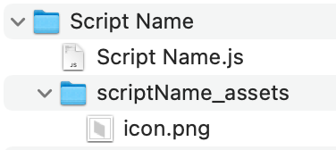
A script’s location can be accessed using the property ui.scriptLocation which will return the script’s parent folder. This can then be used to build relative paths when adding images or other assets to a script’s UI.
For example:
// Create a button and set an imagevar buttonTop = new ui.Button("Top");buttonTop.setImage(ui.scriptLocation + "/scriptName_assets/icon.png");Assets can only be referenced via absolute file paths when running scripts from the JavaScript Editor, In order to use ui.scriptLocation, the script must be saved to the Scripts folder and run from the Scripts menu.
Quick Start
「Quick Start」という見出しのセクションThis example will create a simple window with a title and a button which will print the number of selected items in the scene.
// Set the window titleui.setTitle("Print Selection Script");// Create a buttonvar button1 = new ui.Button("Print Selected Layers");// Set a callback function, this will be run when the button is clickedbutton1.onClick = function () { let sel = api.getSelection(); if (sel.length > 0) { console.log("Number of selected layers: " + sel.length); } else { console.log("There are no selected layers"); }};// Create the layout, the button will be in the middle of the windowui.addStretch();ui.add(button1);ui.addStretch();// Show the windowui.show();UI Module
「UI Module」という見出しのセクションadd(widget:object…)
「add(widget:object…)」という見出しのセクションAdd a widget to the default layout. Multiple comma separated items can be added at once.
show()
「show()」という見出しのセクションShow the script window.
setTitle(string:title)
「setTitle(string:title)」という見出しのセクションSet the script window title.
ui.setTitle("Print Selection Script");ui.show();setBackgroundColor(color:string)
「setBackgroundColor(color:string)」という見出しのセクションSet the script window’s background color.
ui.setBackgroundColor("#7a7a7a");//ui.setBackgroundColor("red");ui.show();addStretch()
「addStretch()」という見出しのセクションAdd stretch to the default layout. Adding stretch will push widgets to the other side of the layout.
addSpacing(spacing:int)
「addSpacing(spacing:int)」という見出しのセクションAdd some fixed spacing to the default layout.
setSpaceBetween(spacing:int)
「setSpaceBetween(spacing:int)」という見出しのセクションSet the amount of spacing automatically added between each item added to the default layout. The default is 3 pixels.
// Ensure no space is added between widgets when they are added to the default layoutui.setSpaceBetween(0);setMargins(left:int, top:int, right:int, bottom:int)
「setMargins(left:int, top:int, right:int, bottom:int)」という見出しのセクションSet the margins of the default layout (how far from the edges the widgets can be). The default value is 3 pixels on all sides.
// Remove all margins from the default layoutui.setMargins(0, 0, 0, 0);scriptLocation → string
「scriptLocation → string」という見出しのセクションThe path to the folder which contains this script. This is blank for UIs created from the JavaScript Editor.
var button = new ui.ImageButton( ui.scriptLocation + "/myScript_assets/icon.png");addCallbackObject(callback:object)
「addCallbackObject(callback:object)」という見出しのセクションRegister a callback object with the script. See the details below in the Application Callbacks section.
function Callbacks() { // This callback will be called whenever the scene selection changes this.onSelectionChanged = function () { console.log("Selection Changed"); };}// Create the callback objectvar callbackObj = new Callbacks();// Add a callback object (you can have several if you're that way inclined)ui.addCallbackObject(callbackObj);setToolbar()
「setToolbar()」という見出しのセクションTells the window that it’s a toolbar, it will not include a docking tab.
ui.setToolbar();//32px for Icon, 12px for Window Titleui.setFixedHeight(44);var layout = new ui.HLayout();var button = new ui.ImageButton( `${api.getAppAssetsPath()}/icons/shelf_Cel.png`);button.setImageSize(32, 32);var button2 = new ui.ImageButton( `${api.getAppAssetsPath()}/icons/shelf_Extrude.png`);button2.setImageSize(32, 32);var button3 = new ui.ImageButton( `${api.getAppAssetsPath()}/icons/shelf_LayoutGrid.png`);button3.setImageSize(32, 32);layout.add(button, button2, button3);layout.addStretch();ui.add(layout);ui.show();setVerticalToolbar()
「setVerticalToolbar()」という見出しのセクションTells a toolbar window to expect a vertical layout, it will not include a docking tab.
ui.setToolbar();ui.setVerticalToolbar();ui.setFixedWidth(44);var layout = new ui.VLayout();var button = new ui.ImageButton( `${api.getAppAssetsPath()}/icons/shelf_Cel.png`);button.setImageSize(32, 32);var button2 = new ui.ImageButton( `${api.getAppAssetsPath()}/icons/shelf_Extrude.png`);button2.setImageSize(32, 32);var button3 = new ui.ImageButton( `${api.getAppAssetsPath()}/icons/shelf_LayoutGrid.png`);button3.setImageSize(32, 32);layout.add(button, button2, button3);layout.addStretch();ui.add(layout);ui.show();setMinimumWidth(width:int)
「setMinimumWidth(width:int)」という見出しのセクションSet a minimum width for a UI window. ⚠️ Specifying a value could break a layout when docking a window.
ui.setMinimumWidth(200);ui.show();setMinimumHeight(height:int)
「setMinimumHeight(height:int)」という見出しのセクションSet a minimum height for a UI window. ⚠️ Specifying a value could break a layout when docking a window.
ui.setMinimumHeight(200);ui.show();setMaximumWidth(width:int)
「setMaximumWidth(width:int)」という見出しのセクションSet a maximum width for a UI window. ⚠️ Specifying a value could break a layout when docking a window.
ui.setMaximumWidth(200);ui.show();setMaximumHeight(height:int)
「setMaximumHeight(height:int)」という見出しのセクションSet a maximum height for a UI window. ⚠️ Specifying a value could break a layout when docking a window.
ui.setMaximumHeight(200);ui.show();setFixedWidth(width:int)
「setFixedWidth(width:int)」という見出しのセクションSet a fixed width for a UI window. ⚠️ Specifying a value could break a layout when docking a window.
ui.setFixedWidth(200);ui.show();setFixedHeight(height:int)
「setFixedHeight(height:int)」という見出しのセクションSet a fixed height for a UI window. ⚠️ Specifying a value could break a layout when docking a window.
ui.setFixedHeight(200);ui.show();setFixedSize(width:int, height:int)
「setFixedSize(width:int, height:int)」という見出しのセクションSet a fixed width and height for a UI window. ⚠️ Specifying a value could break a layout when docking a window.
ui.setFixedSize(400, 200);ui.show();fieldWidth → int
「fieldWidth → int」という見出しのセクションGets the default width for a numeric field.
fieldHeight → int
「fieldHeight → int」という見出しのセクションGets the default height for a numeric field.
size → {x:number, y:number}
「size → {x:number, y:number}」という見出しのセクションReturns the size of the window.
registerDragDropMimeType(mimeType:string)
「registerDragDropMimeType(mimeType:string)」という見出しのセクションUI windows support drag and drop functionality. The Container Widget can also be used to create multiple, distinct (noncontiguous) drag and drop areas within the same UI window – meaning the event will only occur within the Container rather than the entire UI window. At least one MIME type for the UI window to accept must be registered. To register multiple MIME types, add each on a separate line.
Valid MIME type values are:
layerIds// Accepts a Layer(s). Returns{"layerIds":[layerId:string]}assetIds// Accepts an Asset(s) from the Assets Window. Returns{"assetIds":[assetId:string]}url// Accepts a file or web URL. Returns{"text":URL:string,"url":URL:string}color// Accepts a color swatch. Returns{"colorHexA":hexA:string,"colorHex":hex:string}text// Accepts a string. Returns{"text":text:string}
Callbacks
「Callbacks」という見出しのセクションonDragEnter// fire when the drag event enters the UI window/ContaineronDragLeave// fire when the drag event leaves the UI window/ContaineronDrop// fire when the drop event occursonContextMenuAboutToShow// clear and re-populate the UI context menuonResize// fire when the window resizes
// Drag and drop examplevar label = new ui.Label("Drag and drop a layer in here");var layout = new ui.HLayout();layout.addStretch();layout.add(label);layout.addStretch();var container = new ui.Container();container.setBackgroundColor("#1755a6");container.setRadius(3, 3, 3, 3);container.setLayout(layout);// This step is essential, register at least one MIME type that the Window should accept.ui.registerDragDropMimeType("layerIds");ui.onDragEnter = function () { console.log("Drag Enter"); container.setBorder("#e62163", "2");};ui.onDragLeave = function () { console.log("Drag Leave"); container.setBorder();};ui.onDrop = function (dropInfo) { container.setBorder(); label.setText("You dropped: " + api.getNiceName(dropInfo["layerIds"][0]));};ui.setMargins(6, 6, 6, 6);ui.add(container);ui.show();// Return the current size of the windowui.onResize = function () { console.debug(`New size: ${ui.size().width} x ${ui.size().height}`);};ui.show();runFileScript(filePath:string)
「runFileScript(filePath:string)」という見出しのセクションRun UI Scripts from within other UI Scripts.
// create a buttonvar button = new ui.Button("Run Script");// set the onClick callback functionbutton.onClick = function () { ui.runFileScript("/Path/To/Script.js");};// add the button to the layoutui.add(button);// show the windowui.show();addMenuItem({name:string, onMouseRelease:function, enabled:bool, icon:string})
「addMenuItem({name:string, onMouseRelease:function, enabled:bool, icon:string})」という見出しのセクションAdd a new context (right click) menu item to a UI window or Container.
The object contains the following properties:
name:string// The menu item text. If the name is empty (i.e. ""), a separator will be added.enabled:bool// This is optional. Set this to false to disable the context menu item.onMouseRelease:function// this is a callback function. Set a function on this property and it will be called when the menu item is clicked.icon:string// an optional path to an icon for the menu item.
// Context Menu examplevar label = new ui.Label("Right click in here");var layout = new ui.HLayout();layout.addStretch();layout.add(label);layout.addStretch();var firstMenuItem = { name: "Item One", onMouseRelease: function () { return console.log("Clicked " + firstMenuItem.name); }, icon: `${api.getAppAssetsPath()}/icons/load.png`,};var separatorItem = { name: "",};var secondMenuItem = { name: "Item Two", onMouseRelease: function () { return console.log("Clicked " + secondMenuItem.name); },};var thirdMenuItem = { name: "Item Three", onMouseRelease: function () { return console.log("Clicked " + thirdMenuItem.name); }, enabled: false,};ui.addMenuItem(firstMenuItem);ui.addMenuItem(separatorItem);ui.addMenuItem(secondMenuItem);ui.addMenuItem(thirdMenuItem);ui.showContextMenuOnRightClick();ui.setMargins(6, 6, 6, 6);ui.add(layout);ui.show();// Context Menu example including a showContextMenu() functionvar label = new ui.Label("Right click in here");var layout = new ui.HLayout();layout.addStretch();layout.add(label);layout.addStretch();var container = new ui.Container();container.setBackgroundColor("#1755a6");container.setRadius(3, 3, 3, 3);container.setLayout(layout);var firstMenuItem = { name: "Item One", onMouseRelease: function () { return console.log("Clicked " + firstMenuItem.name); }, icon: `${api.getAppAssetsPath()}/icons/load.png`,};var separatorItem = { name: "",};var secondMenuItem = { name: "Item Two", onMouseRelease: function () { return console.log("Clicked " + secondMenuItem.name); },};var thirdMenuItem = { name: "Item Three", onMouseRelease: function () { return console.log("Clicked " + thirdMenuItem.name); }, enabled: false,};ui.addMenuItem(firstMenuItem);ui.addMenuItem(separatorItem);ui.addMenuItem(secondMenuItem);ui.addMenuItem(thirdMenuItem);container.onMousePress = function (position, button) { if (button == "right") { ui.showContextMenu(); }};ui.setMargins(6, 6, 6, 6);ui.add(container);ui.show();addSubMenu({name:string, onMouseRelease:function, enabled:bool, icon:string})
「addSubMenu({name:string, onMouseRelease:function, enabled:bool, icon:string})」という見出しのセクションAdd a new sub menu item to a context menu item. A menu object must be created, populated and then added to the Menu Item via the addSubMenu function with a new Menu class. See example below.
See addMenuItem for object property descriptions.
// Context Menu with sub-menu examplevar label = new ui.Label("Right click in here");var layout = new ui.HLayout();layout.addStretch();layout.add(label);layout.addStretch();var container = new ui.Container();container.setBackgroundColor("#1755a6");container.setRadius(3, 3, 3, 3);container.setLayout(layout);var firstMenuItem = { name: "Item One", onMouseRelease: function () { return console.log("Clicked " + firstMenuItem.name); }, icon: `${api.getAppAssetsPath()}/icons/load.png`,};var separatorItem = { name: "",};var secondMenuItem = { name: "Item Two", onMouseRelease: function () { return console.log("Clicked " + secondMenuItem.name); },};var thirdMenuItem = { name: "Item Three", onMouseRelease: function () { return console.log("Clicked " + thirdMenuItem.name); }, enabled: false,};ui.addMenuItem(firstMenuItem);ui.addMenuItem(separatorItem);ui.addMenuItem(secondMenuItem);ui.addMenuItem(thirdMenuItem);var subMenu = new ui.Menu("Sub-Menu");var subOne = { name: "Sub One",};var subTwo = { name: "Sub Two",};subMenu.addMenuItem(subOne);subMenu.addMenuItem(subTwo);ui.addSubMenu(subMenu);container.onMousePress = function (position, button) { if (button == "right") { ui.showContextMenu(); }};ui.setMargins(6, 6, 6, 6);ui.add(container);ui.show();showContextMenuOnRightClick()
「showContextMenuOnRightClick()」という見出しのセクションAutomatically show the context menu at the mouse location when right clicking in the window.
ui.showContextMenuOnRightClick();ui.addMenuItem({ name: "Item", onMouseRelease: function () { return console.log("Clicked"); }, enabled: true,});ui.show();showContextMenu()
「showContextMenu()」という見出しのセクションShow the context at the mouse location. Use this to show menus on left click.
clearContextMenu()
「clearContextMenu()」という見出しのセクションClear the context menu. This can be used to update context menu items.
onClose
「onClose」という見出しのセクションA callback function that can be used to perform actions (e.g. remove temporary files) when closing the ui Window.
ui.onClose = function () { console.log("About to close");};ui.show();getThemeColor(colorName:string) → string
「getThemeColor(colorName:string) → string」という見出しのセクションReturns a hex string for a color label from the UI theme. Note - this will not provide all the colors in the UI as some UI elements ‘anchor’ off these colours to create darker/lighter variations as needed.
Possible color labels are: AppBackground, Window, Base, AlternateBase, Text, Highlight, Midlight, Shadow, Dark, Mid, Light, Accent1, Accent2, Accent3, Accent4 and Accent5.
console.log(ui.getThemeColor("Window"));ui.show();chooseFolderPath(startFilePath:string) → string
「chooseFolderPath(startFilePath:string) → string」という見出しのセクションReturns the chosen folder path or empty if the user presses cancel from the dialog box.
chooseFileToSave(startFilePath:string, fileFilter:string) → string
「chooseFileToSave(startFilePath:string, fileFilter:string) → string」という見出しのセクションReturns the chosen file path to create or empty if the user presses cancel from the dialog box. The file filter string should follow the format “Palettes (_.pal _.ase *.theme)“
var filePath = ui.chooseFileToSave(api.getRenderPath(), "PNG (*.png)");if (!filePath) { return;}api.renderPNGFrame(filePath, 100);chooseFileToOpen(startFilePath:string, fileFilter:string) → string
「chooseFileToOpen(startFilePath:string, fileFilter:string) → string」という見出しのセクションReturn the chosen file path. This is empty if the User presses ‘Cancel’ from the dialog box. The file filter string should follow the format “Palettes (_.pal _.ase *.theme)“.
openSceneDialog()
「openSceneDialog()」という見出しのセクションOpen a file browser to open a Cavalry scene (.cv).
setCallbacksActive(active:bool)
「setCallbacksActive(active:bool)」という見出しのセクションThis can be used to temporarily disable UI callbacks.
Widgets
「Widgets」という見出しのセクションCommon Functions
「Common Functions」という見出しのセクションAll Widgets share the following common functions:
setEnabled(state:bool)// enable/disable the widgetisEnabled() → bool// check if a widget is enabledsetHidden(state:bool)// hide a widgetisHidden() → bool// check if a widget is hiddensetSize(width:int, height:int)// set the size of a widgetsetFixedWidth(width:int)// set a fixed width for the widgetsetFixedHeight(height:int)// set a fixed height for the widgetsetMinimumHeight(height:int)// set a minimum height for the widgetsetMaximumHeight(height:int)// set a maximum height for the widgetsetMinimumWidth(width:int)// set a minimum width for the widgetsetMaximumWidth(width:int)// set a maximum width for the widgetsetToolTip(tooltip:string)// set a tooltip for the widgetsetBackgroundColor(hex:string)// set the background color for the widgetgetUUID()// returns a unique identifier for the widgetgeometry() → {x:number, y:number, width:number, height:number, centre:{x:number, y:number}, left:number, right:number, top:number, bottom:number}// return a widget’s geometry in Global coordinates. This can be useful to anchor a popover Container to a widget.setCornerRounding(radius:int)// set corner rounding for a widgetsetContentsMargins(left:int, top:int, right:int, bottom:int)// set the distance from the edges of the widget that content is allowed to be placedsetTransparentForMouseEvents(transparent=false)// set totrueto make a widget see-through for mouse events
Button
「Button」という見出しのセクションCreate a button.
Functions
「Functions」という見出しのセクションButton(buttonText:string)// the constructor requires a default labelsetText(buttonText:string)// set the button text.setFontSize(pixelSize:int)setImage(path:string)// path to an image (relative paths can be built using theui.scriptLocationproperty).setImageSize(width:int, height:int)setDrawStroke(state:bool)// by default buttons have a stroke affordance, this can be removed by calling this method with false.setSpacing(spacing:int)// sets the space before the icon
Callbacks
「Callbacks」という見出しのセクションonClick()// a callback function that will be called when the button is clicked.
// create a buttonvar button = new ui.Button("Click me!");// set the onClick callback functionbutton.onClick = function () { console.log("Button was clicked");};// add the button to the layoutui.add(button);// show the windowui.show();Checkbox
「Checkbox」という見出しのセクションA standard checkbox widget. This doesn’t contain a label so combining it with a Label is highly recommended. You set the default value when you create the class.
Functions
「Functions」という見出しのセクションCheckbox(state:bool)// the constructor requires a default valuegetValue() → boolsetValue(state:bool)
Callbacks
「Callbacks」という見出しのセクションonValueChanged// assign a function to this variable to be called when the widget’s state is changed.
// create a Checkboxvar cb = new ui.Checkbox(false);// set the onValueChanged callback functioncb.onValueChanged = function () { console.log("Checkbox toggled, new value is: " + cb.getValue());};// add the checkbox to a layout with a labelvar label = new ui.Label("Super Amazing Checkbox Demo");var horizontalLayout = new ui.HLayout();horizontalLayout.add(label);horizontalLayout.add(cb);// Add the layout to the windowui.add(horizontalLayout);// show the windowui.show();ColorChip
「ColorChip」という見出しのセクションA color picker widget. Double clicking will automatically load the Color Editor. The colours returned and set are all hex values – the utilities in the Cavalry Module can be used to help with conversions.
Functions
「Functions」という見出しのセクションColorChip()getColor() → stringgetColorWithAlpha() → stringsetColor(hex:string)setAcceptsDrops(accepts:bool)// when true, dragging a dropping colors dragged allow dragging
Callbacks
「Callbacks」という見出しのセクションonValueChanged// assign a function to this variable to be called when the widget’s color is changed.
var colorChip = new ui.ColorChip();colorChip.setAcceptsDrops(true);colorChip.setSize(100, 18);colorChip.setColor("#f2bf5e");ui.add(colorChip);ui.show();ColorPalette
「ColorPalette」という見出しのセクションA widget that can be used to display multiple colours at once, it’s useful for creating scripts that deal with color workflows. This is a feedback widget in that users cannot directly interact with it. The setColors function is not fussy about the # prefix on the hex color strings (if the hash is missing it will be added automatically).
Functions
「Functions」という見出しのセクションColorPalette()getColors() → [string]setColors(hex:[string])// Set the colours to be used by the palette widget.
This example demos a simple Color Palette generator script.
// The number of colors our palette generator will createvar numColors = 10;// Create a color palette objectvar colorPalette = new ui.ColorPalette();// Create a color chip objectvar colorChip = new ui.ColorChip();// Set our initial colorcolorChip.setColor("#099789");// A simple and fairly dumb function that generates some color shades for our palette// There's no error checking (e.g for values above 1 or below 0).colorChip.getShades = function (color) { let outColors = []; // Convert hex colours to HSV let hsv = cavalry.hexToHsv(color); let step = 0.3 / numColors; let startingValue = hsv.v - step * (numColors * 0.5); for (let i = 0; i < numColors; i += 1) { hsv.v = startingValue + step * i; outColors.push(cavalry.hsvToHex(hsv.h, hsv.s, hsv.v)); } return outColors;};// Update the color palette when the color from the color chip is changedcolorChip.onValueChanged = function () { colorPalette.setColors(colorChip.getShades(colorChip.getColor()));};// Set the initial palettecolorPalette.setColors(colorChip.getShades(colorChip.getColor()));// Create a layout for the color chip that includes a labelvar label = new ui.Label("Main Color");var hLayout = new ui.HLayout();hLayout.add(label);hLayout.add(colorChip);ui.add(hLayout);ui.add(colorPalette);// Create a button that will generate our color array based on the palettevar button = new ui.Button("Create Color Array");button.onClick = function () { // Create a color array let colorId = api.create("colorArray", "My Color Array"); // By default all arrays get an entry, let's remove it so we start from a clean slate. api.removeArrayIndex(colorId, "array.0"); // Get the colours from the color palette let colours = colorPalette.getColors(); for (let color of colours) { // Add a new attribute to our colorArray, the index of the new array attribute is returned let index = api.addArrayIndex(colorId, "array"); // To set an object name from a variable we need to use bracket notation i.e [] api.set(colorId, { ["array." + index]: color }); }};ui.add(button);// Show the windowui.show();ColorPicker
「ColorPicker」という見出しのセクションAn eye dropper button you can use to pick colours from the screen.
Functions
「Functions」という見出しのセクションColorPicker()getColor() → string// returns the color value as a hex string.
Callbacks
「Callbacks」という見出しのセクションonColorChangedonColorAccepted
var picker = new ui.ColorPicker();picker.onColorChanged = function () { console.log(picker.getColor());};picker.onColorAccepted = function () { console.log("Final color: " + picker.getColor());};ui.add(picker);ui.show();ColorWheel
「ColorWheel」という見出しのセクションA color wheel.
Functions
「Functions」という見出しのセクションColorWheel()getColor() → string// returns the color value as a hex string.setColor(hex:string)// set a hex string to be the current color
Callbacks
「Callbacks」という見出しのセクションonColorChanged
var colorWheel = new ui.ColorWheel();colorWheel.onColorChanged = function () { console.log(colorWheel.getColor());};ui.add(colorWheel);ui.show();Container
「Container」という見出しのセクションA Container can be used in several scenarios such as:
- setting a background color for a Layout.
- making separate controls look like they’re related.
- detecting drag and drop events and/or respond to mouse events (e.g. trigger a context menu). See addMenuItem for more information on creating context menus.
- launching a secondary window for ‘settings’.
Functions
「Functions」という見出しのセクションContainer()setRadius(topLeft:number, topRight:number, btmRight:number, btmLeft:number)// set the corner rounding of the Container.setLayout(layout:object)// set a layout for the container.useHoverEvents(use:bool)// if set to true, mouseMoveEvents will fire even when the mouse isn’t pressed.setBorder(color:string, width:number, dashWidth:number, dashGap:number)// dashWidth and dashGap are optional. The color argument is a hex colour string. A border can be removed by callingsetBorder().show()// can be be used to launch a Container as a secondary window.close()// close a Container opened viashow().move(x:int, y:int)// will offset the secondary window by the given coordinates (relative to the parent window).showAsPopover(x:number, y:number)// shows the Container as a popover at the given location.setPreferredPopoverSide(side:int)// determine in which direction a popover should appear.- 0: left
- 1: right
- 2: top
- 3: bottom
Callbacks
「Callbacks」という見出しのセクションonMousePress(position:{"x":number, "y":number}, button:string)// fire when the mouse is pressedonMouseRelease(position:{"x":number, "y":number}, button:string)// fire when the mouse is releasedonMouseDoubleClick(position:{"x":number, "y":number}, button:string)// fire when the mouse is double clickedonMouseMove(position:{"x":number, "y":number})// only fires when the mouse is pressed unlessuseHoverEventsis trueonMouseEnter// fire when the mouse enters the ContaineronMouseLeave// fire when the mouse leaves the ContaineronDragEnter// fire when the drag event enters the Container. See registerDragDropMimeType for more information.onDragLeave// fire when the drag event leaves the Container. See registerDragDropMimeType for more information.onDrop// fire when the drop event occurs. See registerDragDropMimeType for more information.
var prefix = new ui.Label("X1");prefix.setTextColor("#c8c8c8");var numeric = new ui.NumericField(100);var layout = new ui.HLayout();layout.add(prefix);layout.add(numeric);// Container can be used to compose layouts into 'widgets'// That way different elements can be designed to seem connectedvar container = new ui.Container();container.setBackgroundColor("#6437ff");container.setRadius(3, 3, 3, 3);container.setSize(150, 22);container.setLayout(layout);ui.setMargins(6, 6, 6, 6);ui.add(container);ui.show();// Using mouse click eventsui.setTitle("Flow Layout");var flowLayout = new ui.FlowLayout(2, 2);flowLayout.setSpaceBetween(3);flowLayout.setMargins(2, 2, 2, 2);for (let step = 0; step < 25; step++) { let container = new ui.Container(); container.setSize(60, 60); container.setBackgroundColor("#4ffd7a"); container.setRadius(3, 3, 3, 3); container.onMousePress = function (position, button) { container.setBackgroundColor("#c8c8c8"); }; flowLayout.add(container);}ui.add(flowLayout);ui.show();// Drag and drop example using Containersfunction createLayout() { const label = new ui.Label("Drag and drop a color swatch"); const layout = new ui.HLayout(); layout.addStretch(); layout.add(label); layout.addStretch(); return layout;}var topContainer = new ui.Container();topContainer.setBackgroundColor("#1755a6");topContainer.setRadius(3, 3, 3, 3);topContainer.setLayout(createLayout());topContainer.registerDragDropMimeType("color");topContainer.onDragEnter = function () { topContainer.setBorder("#9e9e9e", "2", "5", "5");};topContainer.onDragLeave = function () { topContainer.setBorder();};topContainer.onDrop = function (dropInfo) { topContainer.setBackgroundColor(dropInfo["colorHex"]); topContainer.setBorder();};var bottomContainer = new ui.Container();bottomContainer.setBackgroundColor("#6838c0");bottomContainer.setRadius(3, 3, 3, 3);bottomContainer.setLayout(createLayout());bottomContainer.registerDragDropMimeType("color");bottomContainer.onDragEnter = function () { bottomContainer.setBorder("#9e9e9e", "2", "5", "5");};bottomContainer.onDragLeave = function () { bottomContainer.setBorder();};bottomContainer.onDrop = function (dropInfo) { bottomContainer.setBackgroundColor(dropInfo["colorHex"]); bottomContainer.setBorder();};ui.setMargins(6, 6, 6, 6);ui.add(topContainer);ui.add(bottomContainer);ui.show();// Loading a Container as a secondary windowvar label = new ui.Label("Congratulations!");var layout = new ui.HLayout();layout.addStretch();layout.add(label);layout.addStretch();var container = new ui.Container();container.setMinimumWidth(200);container.setMinimumHeight(200);container.setBackgroundColor("#6437ff");container.setRadius(3, 3, 3, 3);container.setLayout(layout);var openButton = new ui.Button("Show Container Window");openButton.onClick = function () { container.show();};var closeButton = new ui.Button("Close Container Window");closeButton.onClick = function () { container.close();};ui.add(openButton);ui.add(closeButton);ui.show();// Loading a Container as a Popovervar label = new ui.Label("Congratulations!");var layout = new ui.HLayout();layout.addStretch();layout.add(label);layout.addStretch();var container = new ui.Container();container.setMinimumWidth(200);container.setMinimumHeight(200);container.setBackgroundColor("#6437ff");container.setRadius(3, 3, 3, 3);container.setLayout(layout);var openButton = new ui.Button("Show Popover Window");openButton.onClick = function () { let geo = openButton.geometry(); container.setPreferredPopoverSide(0); container.showAsPopover(geo.left, geo.centre.y);};ui.add(openButton);ui.show();Draw custom shapes via cavalry.Path. Paths can be described by using the paint object (examples below).
Functions
「Functions」という見出しのセクションaddPath(pathObject:object, paintInfo:object)// adds a path to be drawn.clearPaths()// erase all paths from the draw store.redraw()// ask for an update, use this if you update the paths once the UI has been created.saveImage(filePath:string, int:width, int:height)// save the contents of the draw to the filesystem. Use width and height to scale the output to your desired size.useHoverEvents(use:bool)// if set to true, mouseMoveEvents will fire even when the mouse isn’t pressed.
Callbacks
「Callbacks」という見出しのセクションonMousePress(position:{"x":number, "y":number}, button:string)// fire when the mouse is pressedonMouseRelease(position:{"x":number, "y":number}, button:string)// fire when the mouse is releasedonMouseDoubleClick(position:{"x":number, "y":number}, button:string)// fire when the mouse is double clickedonMouseMove(position:{"x":number, "y":number})// only fires when the mouse is pressed unlessuseHoverEventsis true
Possible values for button are:
- left
- right
- middle
The pathObject is an object made from a cavalry.Path() object when calling .toObject(), for example:
var path = new cavalry.Path();var paint = { color: "#4fac3c", stroke: true, strokeWidth: 5 };draw.addPath(path.toObject(), paint);If you wish for a path to have a fill and a stroke, add the path via addPath() twice, first with a fill paint object, and then with a stroke object. The paint object has keys for color, stroke (to determine if the paint is a stroke or fill, it’s fill by default), and strokeWidth. e.g:
// Create a stroke paintvar examplePaint = { color: "#4ffd7a", stroke: true, strokeWidth: 4 };// A full example of the Draw Widgetui.setTitle("Custom Draw");var draw = new ui.Draw();var size = 200;var margin = 2;draw.setSize(size, size);var bezierPath = new cavalry.Path();bezierPath.moveTo(0, margin);bezierPath.cubicTo(size * 0.6, 0.0, size * 0.4, size, size, size - margin);var bezierPaint = { color: "#4ffd7a", stroke: true, strokeWidth: margin * 2 };draw.addPath(bezierPath.toObject(), bezierPaint);var textPath = new cavalry.Path();textPath.addText("easeInOut", 24, 30, 10);var textPaint = { color: "#6437ff" };draw.addPath(textPath.toObject(), textPaint);draw.setBackgroundColor("#c8c8c8");var saveButton = ui.Button("Save Image");saveButton.onClick = function () { // YOUR PATH HERE draw.saveImage("/Path/To/TestSave.png", 300, 300);};var layout = ui.HLayout();layout.addStretch();layout.add(draw);layout.addStretch();ui.add(layout);ui.add(saveButton);ui.setMinimumHeight(240);ui.setMinimumWidth(220);ui.show();// Draw example using interactivityui.setTitle("Click and Drag");var draw = new ui.Draw();var size = 200;var margin = 2;draw.setSize(size, size);//enable this line to have the circle follow the mouse even when the mouse isn't pressed//draw.useHoverEvents(true);draw.onMousePress = function (position, button) { if (button == "left") { mouseDraw(position); }};draw.onMouseRelease = function (position, button) { console.log(`Release, x: ${position.x}, y: ${position.y}, button: ${button}`);};draw.onMouseDoubleClick = function (position, button) { console.log( `Double Click, x: ${position.x}, y: ${position.y}, button: ${button}` );};draw.onMouseMove = function (position) { mouseDraw(position);};function commonDraw() { var textPath = new cavalry.Path(); textPath.addText("Click and drag!", 22, 0, 10); /// centre the text in the window, size is declared above let bbox = textPath.boundingBox(); textPath.translate((size - bbox.width) / 2, 0); let textPaint = { color: "#6437ff" }; draw.addPath(textPath.toObject(), textPaint);}function mouseDraw(position) { draw.clearPaths(); commonDraw(); var mousePath = new cavalry.Path(); mousePath.addEllipse(position.x, position.y, 5, 5); let mousePaint = { color: "#ff24e0" }; draw.addPath(mousePath.toObject(), mousePaint); draw.redraw();}commonDraw();draw.setBackgroundColor("#c8c8c8");var layout = ui.HLayout();layout.addStretch();layout.add(draw);layout.addStretch();ui.add(layout);ui.setMinimumHeight(220);ui.setMinimumWidth(220);ui.show();DropDown
「DropDown」という見出しのセクションA dropdown menu.
Functions
「Functions」という見出しのセクションDropDown()getValue() → int// returns the current index of the DropDown.getText() → string// returns the current text in the DropDown.addEntry(rowText:string)// add an entry to the DropDown.insertSeparator(index:int)// add a dividing line at a given index to visually organise the entries. A separator is counted as an index.setValue(index:int)// set the entry index of the DropDown.setText(rowText:string)// find the DropDown entry with the matching text and set the index to it.populateFontFamilies()// fill the Dropdown with available font family names.populateStylesForFamily(familyName:string)// populate the Dropdown with the styles of a given font family name.clear()// empty the DropDown so it can be repopulated.
Callbacks
「Callbacks」という見出しのセクションonValueChanged// assign a function to this variable to be called when the widget’s value is changed.
// Create two dropdownsvar familyDropDown = new ui.DropDown();var stylesDropDown = new ui.DropDown();// Set some sizesfamilyDropDown.setSize(150, 22);stylesDropDown.setSize(100, 22);// Populate one with all the font families available to CavalryfamilyDropDown.populateFontFamilies();// When the first dropdown changes, populate the second with the styles of that font familyfamilyDropDown.onValueChanged = function () { stylesDropDown.populateStylesForFamily(familyDropDown.getText());};// Populate the styles for the selected font when the window showsstylesDropDown.populateStylesForFamily(familyDropDown.getText());// Create a horizontal layout and add the dropdownsvar hLayout = new ui.HLayout();hLayout.addStretch();hLayout.add(familyDropDown);hLayout.add(stylesDropDown);hLayout.addStretch();// Add the layout to the windowui.add(hLayout);// Resize the windowui.setMinimumWidth(300);ui.setMinimumHeight(100);// Show the windowui.show();FilePath
「FilePath」という見出しのセクションA file path widget that can be used to read folders and files or to create a new file path.
Functions
「Functions」という見出しのセクションFilePath()getFilePath() → stringsetPlaceholder(placeholder:string)// add placeholder text.setFilePath(path:string)setOpenLocation(path:string)// set the path which opens when clicking the folder icon.setMode(argument:string)// valid arguments are “OpenFile”, “OpenDirectory” and “SaveFile”.setFilter(filetype:string)setFontSize(pixelSize:int)hideLoadButton// hide the file iconsetReadOnly(readOnly:bool)// set the widget to read-only to prevent editing the path.
Callbacks
「Callbacks」という見出しのセクションonValueChanged// assign a function to this variable to be called as a user changes the widget’s value.onValueCommitted// assign a function to this variable to be called when a change to the widget is committed – either by the user pressing the Return key or by the field losing focus.
getFilePath does not return a trailing / so this will need to be manually added to any strings (e.g. filePath + "/" + layerId + ".jpg")
// Filter a file path to an exact documentvar openFileFP = new ui.FilePath();openFileFP.setMode("OpenFile");openFileFP.setFilter("Text (*.txt)");ui.add(openFileFP);ui.show();// Get a folder directoryvar openFileDir = new ui.FilePath();openFileDir.setMode("OpenDirectory");ui.add(openFileDir);ui.show();// Set a save file path (to create a new file), the file extension will be added when the file is written.var openFileSave = new ui.FilePath();openFileSave.setMode("SaveFile");ui.add(openFileSave);ui.show();// Set the directory that will open when clicking the folder icon to the Project's Assets path.var setOpen = new ui.FilePath();setOpen.setMode("OpenDirectory");setOpen.setOpenLocation(api.getAssetPath());ui.add(setOpen);ui.show();Image
「Image」という見出しのセクションAdd an image.
Functions
「Functions」という見出しのセクションImage(path:string)// the constructor requires the path to an image be providedsetImage(path:string)// path to an image (relative paths can be built using theui.scriptLocationproperty)setToolTip(tooltip:string)// sets a tooltip for this widget
ui.setTitle("Test Image Script");var image = new ui.Image(ui.scriptLocation + "/MyScript_assets/aPicture.png");ui.add(image);ui.show();ImageButton
「ImageButton」という見出しのセクションCreate a button using an image.
Functions
「Functions」という見出しのセクションImageButton(path:string)// the constructor requires the path to an image be provided (relative paths can be built using theui.scriptLocationproperty)setImage(path:string)// path to an image (relative paths can be built using theui.scriptLocationproperty)setImageSize(width:int, height:int)// set the image’s dimensions.setDrawStroke(state:bool)// by default buttons have a stroke affordance, you can remove this by calling this method with false.setStateButton(state:bool)// setting to true will convert the button to a state button (on/ off) and clicking the button will toggle its state between true and false. When true, the button will colourise light parts of the image with green.setState(state:bool)// sets the button’s state.getState() → bool// returns the current button state.setToolTip(tooltip:string)// sets a tooltip for this widget
Callbacks
「Callbacks」という見出しのセクションonClick()// a callback function that will be called when the button is clicked.
ui.setTitle("Test Image Button Script");// Real image path required ;)var image = new ui.ImageButton( ui.scriptLocation + "/some_assets/somePicture.png");image.setImageSize(60, 60);image.setSize(60, 60);image.setDrawStroke(false);image.onClick = function () { console.log("Image Button Clicked!");};ui.add(image);ui.show();Label
「Label」という見出しのセクションThis is a non editable piece of text which can be used to give feedback, or provide instructions. This text field accepts markdown.
Functions
「Functions」という見出しのセクションLabel(text:string)// The constructor requires a string.setText(text:string)// Set the Label’s text.setTextColor(hex:string)// Set the text colour with a hex value.setAlignment(state:int)// 0: left, 1: centre, 2: right.setToolTip(string)// Sets a tooltip for this widget.setFontSize(pixelSize:int)// Set the font size in pixels.setMarkdown(markdown:string)// Use markdown to format the label. Note that setFontSize will not work if using markdown.
var label = new ui.Label("Super Amazing Label");ui.add(label);ui.show();LineEdit
「LineEdit」という見出しのセクションThis widget can be used for a single line of text entry. Use MultiLineEdit when more than one line is required.
Functions
「Functions」という見出しのセクションLineEdit()getText() → string// get the widget’s contents.setText(text:string)// populate the widget with a string.setTextColor(hex:string)// set the color of the text.setPlaceholder(placeholder:string)// // set placeholder text to be used as a hint.setReadOnly(state:bool)// sets the LineEdit’s editable state.clear()// clear the widget’s contents.setFontSize(pixelSize:int)
Callbacks
「Callbacks」という見出しのセクションonValueChanged// assign a function to this variable to be called as a user changes the widget’s value.onValueCommitted// assign a function to this variable to be called when a change to the widget is committed – either by the user pressing the Return key or by the field losing focus.
var lineEdit = ui.LineEdit();lineEdit.setPlaceholder("Hello, World.");lineEdit.setBackgroundColor("#2d2d2d");lineEdit.setTextColor("#e62163");lineEdit.onValueChanged = function () { console.log("Text has been edited: " + lineEdit.getText());};lineEdit.onValueCommitted = function () { console.log("Return Pressed: " + lineEdit.getText());};ui.add(lineEdit);ui.show();A searchable, selectable and re-orderable list with support for icons, colour swatches, and context menus.
Functions
「Functions」という見出しのセクションList()// constructorshowSearchBar(show:bool)// show or hide the integrated search barsetSelectionMode(mode:string)// set selection behaviour:"none","single", or"extended"setRowsRenamable(renamable:bool)// allow rows to be renamed by double-clickingsetRowsDeletable(deletable:bool)// allow rows to be deletedsetRowsReorderable(reorderable:bool)// allow rows to be reordered by draggingsetRowHeight(height:number)// set the height of each rowsetPlaceholder(text:string)// set placeholder text shown when the list is emptysetModel(model:[object])// set the list data (array of row objects)updateRow(rowData:object)// update a single row by its uuidaddRow(rowData:object)// add a new row to the listgetModel() → [object]// get the current list datagetSelection() → [string]// get an array of selected row uuidssetSearchFilter(filter:string)// programmatically set the search filter textgetSearchFilter() → string// get the current search filter textgetFilteredUUIDs() → [string]// get uuids of rows visible after filtering
Row Data Fields
「Row Data Fields」という見出しのセクションEach row in the model is an object with the following fields:
| Field | Type | Description |
|---|---|---|
uuid | string | Required. Unique identifier for the row. |
label | string | Display text for the row. |
tooltip | string | Tooltip shown on hover. |
icon | string | Path to an 18x18px (+ @2x) icon image. |
swatch | string | Hex colour for a colour chip (with picker on double-click). |
threeDotsMenu | bool | Show a three-dot context menu button. |
borderColor | string | Hex colour for the row border. |
borderWidth | number | Width of the row border. |
Callbacks
「Callbacks」という見出しのセクションonSelectionChanged// called when the selection changes, receives an array of selected uuidsonRowDeleted// called when a row is deleted, receives the uuidonRowRenamed// called when a row is renamed, receives uuid and new nameonRowDoubleClicked// called when a row is double-clicked (only fires if rows are not re-namable), receives uuidonReorder// called when rows are reordered, receives fromIndex and toIndexonSwatchChanged// called when a colour swatch is changed, receives uuid and hex colouronContextMenuRequest// called to build the context menu, receives uuid, should return an array of menu itemsonContextMenuAction// called when a context menu item is clicked, receives uuid and action id
Context Menu Items
「Context Menu Items」という見出しのセクションThe onContextMenuRequest callback should return an array of menu item objects:
{ label: "Menu Item", id: "action_id" }// a clickable menu item{ separator: true }// a separator line
// List Widget Exampleui.setTitle("List Widget Demo");// Create the listvar list = new ui.List();list.showSearchBar(true);list.setSelectionMode("extended");list.setRowsRenamable(true);list.setRowsDeletable(true);list.setRowsReorderable(true);list.setPlaceholder("No items in list");// Sample data with various row featuresvar sampleData = [ { uuid: "item1", label: "Rectangle Layer", icon: api.getAppAssetsPath() + "/icons/load.png", threeDotsMenu: true, }, { uuid: "item2", label: "Ellipse Layer", swatch: "#4ffd7a", threeDotsMenu: true, }, { uuid: "item3", label: "Star Layer", swatch: "#e62163", threeDotsMenu: true, tooltip: "A star shape", }, { uuid: "item4", label: "Text Layer", threeDotsMenu: true }, { uuid: "item5", label: "Highlighted Item", swatch: "#6437ff", borderColor: "#6437ff", borderWidth: 1, },];list.setModel(sampleData);// Selection changed callbacklist.onSelectionChanged = function (selectedUUIDs) { console.log("Selection changed: " + selectedUUIDs.join(", "));};// Row deleted callbacklist.onRowDeleted = function (uuid) { console.log("Row deleted: " + uuid);};// Row renamed callbacklist.onRowRenamed = function (uuid, newName) { console.log("Row renamed: " + uuid + " -> " + newName);};// Row double-clicked callback (only fires if not renamable)list.onRowDoubleClicked = function (uuid) { console.log("Row double-clicked: " + uuid);};// Reorder callbacklist.onReorder = function (fromIndex, toIndex) { console.log("Reordered from " + fromIndex + " to " + toIndex);};// Swatch changed callbacklist.onSwatchChanged = function (uuid, hexColor) { console.log("Swatch changed for " + uuid + ": " + hexColor);};// Decorator (delete/cross button) clicked callbacklist.onDecoratorClicked = function (uuid) { console.log("Decorator clicked: " + uuid);};// Context menu - return array of menu itemslist.onContextMenuRequest = function (uuid) { return [ { label: "Action One", id: "action1" }, { label: "Action Two", id: "action2" }, ];};// Context menu action handlerlist.onContextMenuAction = function (uuid, actionId) { console.log("Menu action '" + actionId + "' on " + uuid); if (actionId === "action1") { console.log("Action One requested for: " + uuid); } else if (actionId === "action2") { console.log("Action Two requested for: " + uuid); }};// Control buttonsvar addButton = new ui.Button("Add Item");addButton.onClick = function () { var newItem = { uuid: "item" + Date.now(), label: "New Item", swatch: "#" + Math.floor(Math.random() * 16777215) .toString(16) .padStart(6, "0"), threeDotsMenu: true, }; list.addRow(newItem);};var clearSearchButton = new ui.Button("Clear Search");clearSearchButton.onClick = function () { list.setSearchFilter("");};var logSelectionButton = new ui.Button("Log Selection");logSelectionButton.onClick = function () { console.log("Current selection: " + JSON.stringify(list.getSelection()));};var logFilteredButton = new ui.Button("Log Filtered");logFilteredButton.onClick = function () { console.log("Filtered UUIDs: " + JSON.stringify(list.getFilteredUUIDs()));};// Layoutvar buttonLayout = new ui.HLayout();buttonLayout.add( addButton, clearSearchButton, logSelectionButton, logFilteredButton);ui.add(list);ui.addSpacing(8);ui.add(buttonLayout);ui.setMinimumHeight(400);ui.setMinimumWidth(350);ui.show();This widget can be used to show context menus.
Menu(name:string)// the name of the menu item when used as a sub-menuaddMenuItem(object)// add a menu item
Modal
「Modal」という見出しのセクションThis widget can be used to show modal windows where an action requires confirmation or further input. Note that order the options appear in is dependent on the OS.
showMessage(message:string)showQuestion(title:string, question:string) → bool// No/Yes - returnstrueif ‘yes’ is clicked.showConfirmation(title:string, question:string) → bool// Cancel/Okay - returnstrueif ‘Okay’ is clicked.showStringInput(windowTitle:string, fieldName:string, defaultValue:string) → string// returns the string entered by the user.
var modal = new ui.Modal();modal.showMessage("Your message here.");//console.log(modal.showQuestion("Title", "Your question here."));//console.log(modal.showStringInput("Enter your name.", "Name", "Your name here."));MultiLineEdit
「MultiLineEdit」という見出しのセクションThis widget can be used for multiple lines of text entry.
Functions
「Functions」という見出しのセクションMultiLineEdit()getText()// get the widget’s contents.setText(text:string)// populate the widget with a string.setTextColor(hex:string)// set the color of the text.setPlaceholder(placeholder:string)// set placeholder text to be used as a hint.setReadOnly(state:bool)// set the MultiLineEdit’s editable state.clear()// clear the widget’s contents.setFontSize(pixelSize:int)
Callbacks
「Callbacks」という見出しのセクションonValueChanged// perform a callback when the widget’s contents changes.
var lineEdit = ui.MultiLineEdit();lineEdit.setPlaceholder("Hello, World.");lineEdit.setBackgroundColor("#2d2d2d");ui.add(lineEdit);ui.show();NumericField
「NumericField」という見出しのセクションA numeric entry field, much like the ones seen in the Attribute Editor. Numeric Fields can be both numbers or ints. The type of the field is set with the setType function.
Functions
「Functions」という見出しのセクションNumericField(number:number)// The constructor requires a default value.getValue() → numbersetValue(value:number)setMin(minimum:number)setMax(maximum:number)setType(type:int)// 0 for integer, 1 for numbersetStep(step:number)// Set the increment the value will increase/decrease by when scrubbing. For example, set a value like 0.01 for finer control.setFontSize(pixelSize:int)
Callbacks
「Callbacks」という見出しのセクションonValueChanged// assign a function to this variable to be called when the widget’s value is changed.
var num = new ui.NumericField(50);var slider = new ui.Slider();slider.setRange(0, 100);slider.setValue(50);slider.onValueChanged = function () { var sliderValue = slider.getValue(); num.setValue(sliderValue);};num.onValueChanged = function () { var numValue = num.getValue(); slider.setValue(numValue);};ui.add(num);ui.add(slider);ui.show();ProgressBar
「ProgressBar」という見出しのセクションA progress bar that can be used to update users on long processes.
Functions
「Functions」という見出しのセクションProgressBar()getValue()// get the current valuesetValue()// set the current valuesetMaximum(maximum:int)// set the maximum value, the bar will show a percentage result of the value when compared to the maximum.
var progress = new ui.ProgressBar();progress.setMaximum(66);progress.setValue(33);ui.add(progress);ui.show();Slider
「Slider」という見出しのセクションA Slider which returns values in a range.
Functions
「Functions」という見出しのセクションSlider()getValue() → numbersetValue(value:number)setRange(min:number, max:number)
Callbacks
「Callbacks」という見出しのセクションonValueChanged// assign a function to this variable to be called when the widget’s value is changed.
var slider = new ui.Slider();slider.setRange(0, 100);slider.onValueChanged = function () { console.log(slider.getValue());};ui.add(slider);ui.show();Layouts
「Layouts」という見出しのセクションLayouts can be used in combination to create more complex UIs.
FlowLayout
「FlowLayout」という見出しのセクションAdd a layout where its content can reflow dependent on the layout’s dimensions.
FlowLayout(horizontalSpacing:int, verticalSpacing:int)add(widget:object)// Add a widget to the root layout.setSpaceBetween(pixel:int)// Set the padding space between widgets in the layout. The default value is 3 pixels.setMargins(left:int, top:int, right:int, bottom:int)// Set the margins of the layout (how far from the edges the widgets can be). The default value is 3 pixels on all sides.itemCount() → int// Returns the number of items in the layout.clear()// Clear the Layout.removeAt(int:index)// Remove an item at the given index.getHeightForWidth(width:int) -> int// returns how high this layout would be at a given width
ui.setTitle("Flow Layout");var flowLayout = new ui.FlowLayout(2, 2);flowLayout.setSpaceBetween(3);flowLayout.setMargins(2, 2, 2, 2);for (let step = 0; step < 25; step++) { let container = new ui.Container(); container.setSize(60, 60); container.setBackgroundColor("#4ffd7a"); container.setRadius(3, 3, 3, 3); container.onMousePress = function () { container.setBackgroundColor("#c8c8c8"); }; flowLayout.add(container);}ui.add(flowLayout);ui.show();HLayout
「HLayout」という見出しのセクションA horizontal layout.
Functions
「Functions」という見出しのセクションadd(widget:object...)// Multiple comma separated items can be added at once.addStretch()addSpacing(pixel:int)setSpaceBetween(pixel:int)// Set the padding space between widgets in the layout. The default value is 3 pixels.setMargins(left:int, top:int, right:int, bottom:int)// Set the margins of the layout (how far from the edges the widgets can be). The default value is 3 pixels on all sides.itemCount() → int// Returns the number of items in the layout.clear()// Clear the Layout. This will delete all UI elements and child layouts within this layout. You cannot access anything you previously added to a layout once you clear it, doing so will result in undefined behaviour.
// Create the ui elementsvar button1 = new ui.Button("Button");var input1 = new ui.NumericField(100);// Create the horizontal layoutvar hLayout1 = new ui.HLayout();hLayout1.add(input1);hLayout1.add(button1);ui.add(hLayout1);// Show the windowui.show();// Clear layout exampleui.setTitle("Clear Layout Demo");// Create a layout and add a label to it.var layout = new ui.VLayout();var label = new ui.Label("A label!");layout.add(label);// Create a button that clears the layout.var button = new ui.Button("Clear Layout");button.onClick = function () { layout.clear();};// Create a button that adds the label.var button2 = new ui.Button("Add Label");button2.onClick = function () { var label = new ui.Label("A label!"); layout.add(label);};// Create the UIui.add(layout);ui.addStretch();ui.add(button);ui.add(button2);ui.show();PageView
「PageView」という見出しのセクションSimilar to a TabView, a PageView allows a UI to have many ‘pages’ of layouts but only show one at a time. They are useful for linear journeys though pages of content - such as wizards and guides. Use forward and back buttons to enable paging through such a view. Note that the page index start at 0.
Functions
「Functions」という見出しのセクションadd(layout:object)// add a layout, this is the content of the pagesetPage(index:int)// set the current page indexcurrentPage() → int// get the current page indexpreviousPage() → int// get the last page indexpageCount() → int// get the total number of pages
var lab1 = new ui.Label("## Page 1");lab1.setAlignment(1);var lab2 = new ui.Label("## Page 2");lab2.setAlignment(1);var lab3 = new ui.Label("## Page 3");lab3.setAlignment(1);var pageLayout1 = new ui.HLayout();pageLayout1.add(lab1);var pageLayout2 = new ui.HLayout();pageLayout2.add(lab2);var pageLayout3 = new ui.HLayout();pageLayout3.add(lab3);var pageView = new ui.PageView();pageView.add(pageLayout1);pageView.add(pageLayout2);pageView.add(pageLayout3);ui.add(pageView);var nextButton = new ui.Button("Next");var prevButton = new ui.Button("Previous");var hLay = new ui.HLayout();hLay.add(prevButton);hLay.add(nextButton);nextButton.onClick = function () { pageView.setPage(pageView.currentPage() + 1);};prevButton.onClick = function () { pageView.setPage(pageView.currentPage() - 1);};ui.add(hLay);ui.show();ScrollView
「ScrollView」という見出しのセクションControl where scroll bars appear in a UI. Set a fixed size for a ScrollView and then when too many items are added, scroll bars will appear. It’s generally a good idea to only restrict a ScrollView’s size in one dimension (width or height).
Functions
「Functions」という見出しのセクションsetLayout(layout:object)// set the contents of the ScrollView.setSize(width:int, height:int)// set a fixed size for the ScrollView.setFixedWidth(width:int)// set a fixed width for the ScrollView.setFixedHeight(height:int)// set a fixed height for the ScrollView.alwaysShowVerticalScrollBar()// force a vertical scrollbar to appear.alwaysShowHorizontalScrollBar()// force a horizontal scrollbar to appear.
var label1 = new ui.Label("Cavalry");label1.setMinimumWidth(80);var label2 = new ui.Label("Animation");label2.setMinimumWidth(80);var label3 = new ui.Label("Software");label3.setMinimumWidth(80);var layout = new ui.HLayout();layout.add(label1, label2, label3);// Use a ScrollView to manually control where scroll bars should appear.var scrollView = new ui.ScrollView();scrollView.setLayout(layout);ui.add(scrollView);ui.show();TabView
「TabView」という見出しのセクションSimilar to the PageView, the TabView can be used for progressively disclosing controls.
Functions
「Functions」という見出しのセクションadd(name:string, layout:object)// name the tab, and set the contents of the tab - which should be a layoutsetTab(index:int)// set the current tab indexcurrentTab() → int// get the current tab indextabCount() → int// get the total number of tabs
var lab1 = new ui.Label("## Page 1");lab1.setAlignment(1);var lab2 = new ui.Label("## Page 2");lab2.setAlignment(1);var lab3 = new ui.Label("## Page 3");lab3.setAlignment(1);var tabLayout1 = new ui.HLayout();tabLayout1.add(lab1);var tabLayout2 = new ui.HLayout();tabLayout2.add(lab2);var tabLayout3 = new ui.HLayout();tabLayout3.add(lab3);var tabView = new ui.TabView();tabView.add("One", tabLayout1);tabView.add("Two", tabLayout2);tabView.add("Three", tabLayout3);ui.add(tabView);ui.show();VLayout
「VLayout」という見出しのセクションA vertical layout.
Functions
「Functions」という見出しのセクションadd(widget:object...)// Multiple comma separated items can be added at once.addStretch()addSpacing(space:int)setSpaceBetween(padding:int)// Set the padding space between widgets in the layout. The default value is 3 pixels.setMargins(left:int, top:int, right:int, bottom:int)// Set the margins of the layout (how far from the edges the widgets can be). The default value is 3 pixels on all sides.addSeparator(string)// Add a horizontal line with a title.itemCount() → int// Returns the number of items in the layout.clear()// Clear the Layout.
// Create the ui elementsvar button1 = new ui.Button("Button");var input1 = new ui.NumericField(100);// Create the vertical layout.var vLayout1 = new ui.VLayout();vLayout1.add(input1);vLayout1.add(button1);ui.add(vLayout1);// Show the windowui.show();// Clear layout exampleui.setTitle("Clear Layout Demo");// Create a layout and add a label to it.var layout = new ui.VLayout();var label = new ui.Label("A label!");layout.add(label);// Create a button that clears the layout.var button = new ui.Button("Clear Layout");button.onClick = function () { layout.clear();};// Create a button that adds the label.var button2 = new ui.Button("Add Label");button2.onClick = function () { var label = new ui.Label("A label!"); layout.add(label);};// Create the UIui.add(layout);ui.addStretch();ui.add(button);ui.add(button2);ui.show();Application Callbacks
「Application Callbacks」という見出しのセクションCallbacks can be registered to learn about various changes in the app.
onCompChanged
「onCompChanged」という見出しのセクションonSceneChanged
「onSceneChanged」という見出しのセクションonSelectionChanged
「onSelectionChanged」という見出しのセクションonAttrChanged
「onAttrChanged」という見出しのセクションonAssetAdded
「onAssetAdded」という見出しのセクションonAssetUpdated
「onAssetUpdated」という見出しのセクションonAssetAsyncLoadFinished
「onAssetAsyncLoadFinished」という見出しのセクションonAssetRemoved
「onAssetRemoved」という見出しのセクションonLayerAdded
「onLayerAdded」という見出しのセクションonLayerRemoved
「onLayerRemoved」という見出しのセクションonJSError
「onJSError」という見出しのセクションonAttributeSelectionChanged
「onAttributeSelectionChanged」という見出しのセクションonPointSelectionChanged
「onPointSelectionChanged」という見出しのセクションonKeySelectionChanged
「onKeySelectionChanged」という見出しのセクションonLicenceUpdated
「onLicenceUpdated」という見出しのセクションonCavalryPreferenceChanged
「onCavalryPreferenceChanged」という見出しのセクションonAppStateChanged
「onAppStateChanged」という見出しのセクションonAttrConnected
「onAttrConnected」という見出しのセクションonAttrDisconnected
「onAttrDisconnected」という見出しのセクションonToolChanged
「onToolChanged」という見出しのセクションIf you’d like to see any additional callbacks, please get in touch.
ui.setTitle("Test Callbacks Script");// Three labels that we'll set when the callbacks are hitselLabel = new ui.Label("Waiting for selection message");compLabel = new ui.Label("Waiting for Composition message");sceneLabel = new ui.Label("Waiting for Scene message");layerLabel = new ui.Label("Waiting for Layer message");assetUpdateLabel = new ui.Label("Waiting for Asset update message");assetAsyncLabel = new ui.Label("Waiting for async Asset update message");stateLabel = new ui.Label("Waiting for application state update message");// The important thing about this object is the function names within it.// As long as one of the callback functions is present the `addCallbackObject` function will take the object.function Callbacks() { // This callback will be called whenever the scene selection changes this.onSelectionChanged = function () { selLabel.setText("Selection size: " + api.getSelection().length); }; // This callback will be called whenever the attribute selection changes this.onAttributeSelectionChanged = function () { selLabel.setText( "Attribute Selection Changed: " + api.getSelectedAttributes().length ); }; // This callback will be called whenever the keyframe selection changes this.onKeySelectionChanged = function () { // Please note api.getSelectedKeyframes() is also available. selLabel.setText( "Keyframe Selection Changed: " + api.getSelectedKeyframeIds().length ); }; // This callback will be called whenever the editable point selection changes this.onPointSelectionChanged = function () { selLabel.setText("Editable Point Selection Changed"); }; // This callback will be called whenever a new composition is loaded this.onCompChanged = function () { compLabel.setText( "Composition Changed: " + api.getNiceName(api.getActiveComp()) ); }; // This callback will be called whenever the Scene is changed (e.g Load Scene or New Scene). this.onSceneChanged = function () { let currentTime = new Date().toLocaleTimeString(); sceneLabel.setText("Scene Changed at: " + currentTime); }; // This callback will be called when ANY attribute in the scene changes. // Do not call heavy functions inside this callback. // Remember to check layer types and attr ids to see if you're interested in this callback. If you aren't, `return`. this.onAttrChanged = function (layerId, attrId) { console.log("attr changed: " + layerId + " attr: " + attrId); }; // This callback will be called whenever an asset is added this.onAssetAdded = function (layerId) { layerLabel.setText("Asset added with id: " + layerId); }; // This callback will be called whenever an asset is removed this.onAssetRemoved = function (layerId) { layerLabel.setText("Asset removed with id: " + layerId); }; // This callback will be called whenever a layer is added this.onLayerAdded = function (layerId) { layerLabel.setText(layerId + " added."); }; // This callback will be called whenever a layer is removed this.onLayerRemoved = function (layerId) { layerLabel.setText(layerId + " removed."); }; // This callback will be called whenever JavaScript errors from an `exec` or `load` call this.onJSError = function (error) { console.log("Message from onJSError Callback: " + error); }; // This callback will be called whenever the licence information changes. this.onLicenceUpdated = function () { console.log("The licence was updated."); }; // This callback will be called whenever a preference is updated. this.onCavalryPreferenceChanged = function (key) { console.log("Preference changed: " + key); }; // This callback will be called whenever an asset (CSV, JSON, text, still image, font) completes import or reloading. this.onAssetUpdated = function (layerId) { assetUpdateLabel.setText("Asset updated with id: " + layerId); }; // This callback will be called whenever an asset (Google Sheet, video, image sequence) completes asynchronous import or reloading. this.onAssetAsyncLoadFinished = function (layerId) { assetAsyncLabel.setText("Import of " + layerId + " complete."); }; // The callback will be called when Cavalry switches to/from the active application. The possible states are 'active' or 'inactive'. this.onAppStateChanged = function (state) { stateLabel.setText("Cavalry is currently: " + state); }; this.onAttrConnected = function (fromAttr, toAttr) { console.log("Connected: " + fromAttr + " → " + toAttr); }; this.onAttrDisconnected = function (fromAttr, toAttr) { console.log("Disconnected: " + fromAttr + " → " + toAttr); }; this.onToolChanged = function(toolName) { console.debug("Tool changed to: " + toolName); };}// Create the callback objectvar callbackObj = new Callbacks();// build the UIui.add(selLabel);ui.add(compLabel);ui.add(sceneLabel);ui.add(layerLabel);ui.add(assetUpdateLabel);ui.add(assetAsyncLabel);ui.add(stateLabel);ui.addStretch();// Add a callback object (you can have several if you're that way inclined)ui.addCallbackObject(callbackObj);// Show the windowui.show();Timer
「Timer」という見出しのセクションTimers can be used in UI scripts and can be useful for polling Web APIs. When the Timer is triggered it will call an onTimeout() function on the Timer object. Implement this function for a Timer to execute logic when this happens. See Timer for more information.
Timers should not be used to detect changes to the scene, please use Application Callbacks for this purpose.
- Each script has its own JavaScript sandbox so pollution of the global namespace is not possible.
- When testing UI Scripts in the JavaScript Editor only one UI Script window can be loaded at a time.